Nicole is the lead designer of the CVSuite and has worked on the project since its inception. She lives in Boulder and loves to get outside and enjoy the mountains every chance she gets.
What is your experience in the arts and with creativity? How did you come to work at WESTAF on Creative Vitality Suite?
At age 8, a box of oil paints was given to me as a hand-me-down, and I fell in love. One of my first works was a modern piece involving splatter painting, a true product of the ‘80s! I made the leap to design in college, attending the College for Creative Studies in Detroit, and graduated with my BFA in design. Post graduation I moved out to Santa Cruz, California and started my pursuit of information design working on one of the first distance-learning software applications. I was working with directly with a PHD chemist to design a college chemistry course and made the exciting discovery that concepts I’d missed in high school were much more digestible when I was taught them the way I learn: visually and experientially. This was the beginning of my interest in how the sciences related to creativity.
Moving to Colorado in 2006 I worked for four years with a firm in Boulder that utilized large amounts of data, designing for the major brokerage firms on Wall Street. I returned to school to get my M.S. degree in 2012, studying the use of technology in developing countries. My thesis research was conducted in Kathmandu at Nepal’s largest fairtrade handicraft organization. Returning from Nepal, I was interested in pursuing my passion for working at the intersection of creativity and technology when I was invited to interview at WESTAF. My work on the CVSuite build is a culmination of many interests and skills, including a desire to see the arts evolve and remain relevant.
You specialize in data visualization. What is the greatest challenge you face in creating a successful data visualization?
The greatest challenge lies in clearly understanding the objective and then accessing the correct data to support the objective. The next challenge is framing the objective in terms of a visual that tells the correct story to the audience you are trying to reach. After I create a visualization, I go back and double check to make sure the visuals support the point I’m trying to make. It is easy to make numbers look pretty, but, just like bad data, bad visuals give a false impression and end up creating doubt in the viewer around the validity of a message and the numbers behind it.
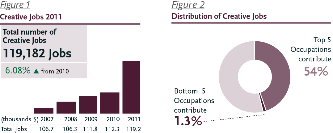
An example objective could be: Show creative occupations with the greatest impact.
We look at the total number of jobs (119,182) and locate which five occupations have the most jobs (Figure 1). Great, this is interesting, and we know which occupations have a lot of jobs; we are halfway to serving our objective.When we take it farther and ask how this compares to all creative occupations using a visual that shows the impact of occupations with the most workers, we see that over half of the creative jobs are attributed to these top occupations (Figure 2). This provides more insight about impact.

You work in the Denver area and live in Boulder–two hotbeds of technology development activity. How, if at all, has living and working in a technology-saturated environment impacted your work?
It has impacted my work very much. The biggest factor is people. Being surrounded by and a part of two communities that are on the forefront of tech start-ups definitely provides for engaging conversations and experiences. In Boulder we are surrounded by research laboratories, renewable energy companies, a major university, and one of the nation’s top start-up communities. These factors create an environment where technology has become ubiquitous. The benefit of this is a network of people who have experience with nearly every specialization imaginable. When building CVSuite, it was essential to draw on this network to save time and money.
Now and again, I come across a data visualization that is visually awesome but inscrutable. How do those “beautiful disasters” happen?
Agreed, there are many hard-to-understand depictions of data. The proliferation of infographics has taken a powerful type of visual language and converted it into merely pretty pictures and noise. There are many reasons for this. Like any trend, people ripoff originals and believe that if a design looks similar it must be successful. In some cases, they are successful, but in other cases, this is where the trouble starts
At the core is a misunderstanding of how visuals communicate with people. In design, the visual is the result of a process. It is a system, not just an image; creating a system requires accounting for contingencies and understanding context. It requires inquiry into how people use visuals to digest information. I think often these inscrutable visuals are the result of starting from the top down instead of the bottom up. Management tells the marketing department, for example, to use Tableau and make a visualization for the site. A visualization is the result, the answer to a question. If you start with the goal of making “a visualization” you may not end up communicating anything more than a pretty picture.
You manage the CVSuite™ project. What do you believe is the greatest barrier to the arts community’s adoption of that tool?
The biggest barrier to the use of CVSuite is a lack of resources. The Nonprofit arts organizations are plagued by limited resources, both talent and money. This results in the need to create quick solutions that may meet the need for a year or maybe two at the most. CVSuite offers a solution that makes an impact over time. To gain the benefits from the tool requires organizations make a commitment to providing valuable information year in and year out. This is where organizations start to understand the power of data in a single location and really save a significant amount of time and resources.
May
02


Comments are closed.